Ancestry’s New & Improved DNA Matches
RootsTech 2019 has started and Ancestry and MyHeritage are announcing new tools that will be accessible to users on their websites. Yesterday, I spent time working with Ancestry’s new tools: the improved DNA match list page, ThruLines and MyTree Tags. Here’s my take on the new match list and match detail pages.
New & Improved Match List Page
Streamlined match page
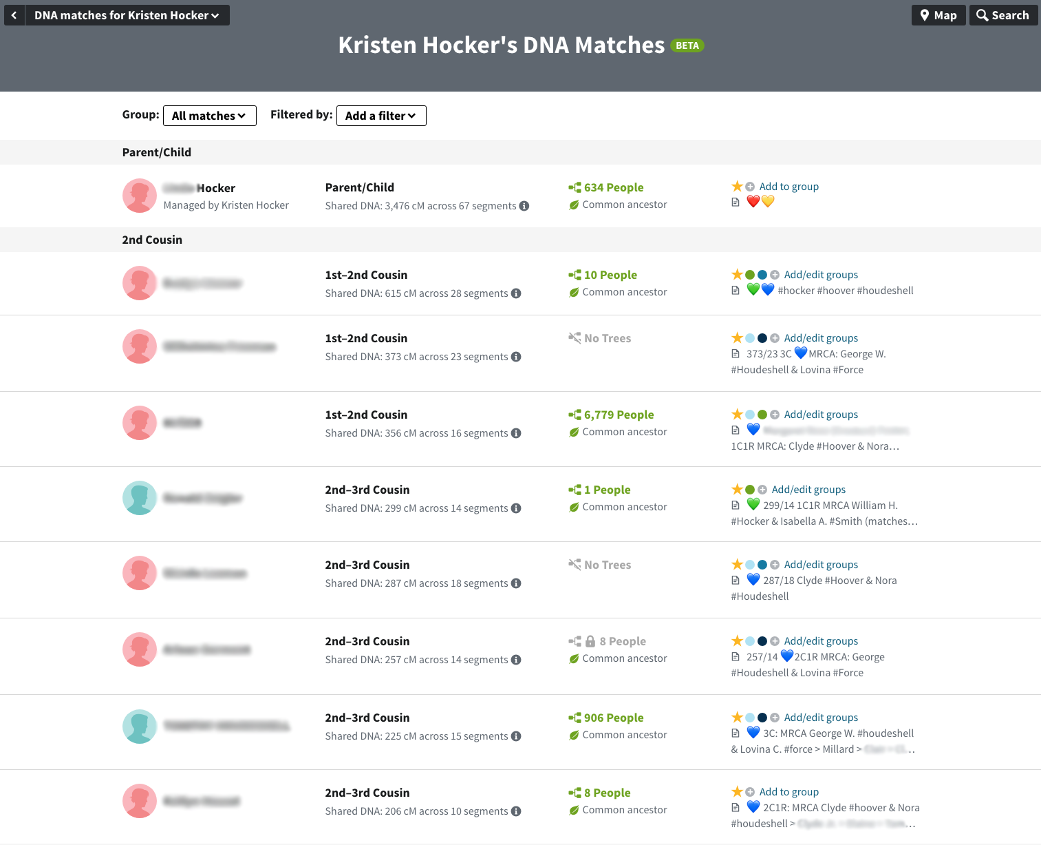
As you can see, Ancestry’s new and improved match page looks much different. The display is condensed and features infinite scrolling, adding additional matches as you reach the bottom of the page.
Additionally, if Mom and/or Dad have tested, your matches are tagged according to which side (or both) of your family they match. Unfortunately, this feature only works if Mom and/or Dad has tested with Ancestry.
In the past, I’ve used a third-party browser add-on to display my notes on the match list page. That is no longer necessary. Any notes added are now displayed as part of the page. No more hovering over an icon to see what the note says.
Filtering & Groups
They’ve also changed the filtering and added groups. Filtering allows you to see matches that have
- common ancestors (previous Ancestor Hints),
- new (unviewed) matches,
- those you’ve messaged,
- with notes,
- private trees,
- public linked trees, and
- unlinked trees.
Filtering based on ancestral communities/regions has been removed.
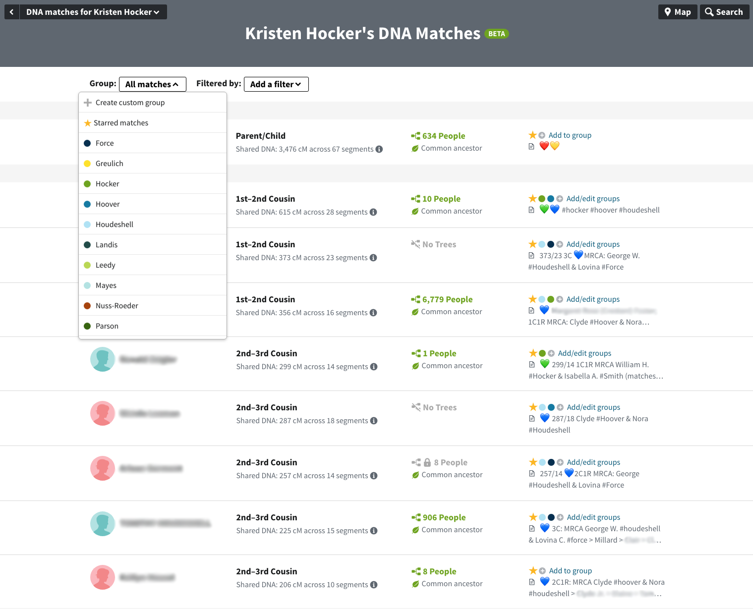
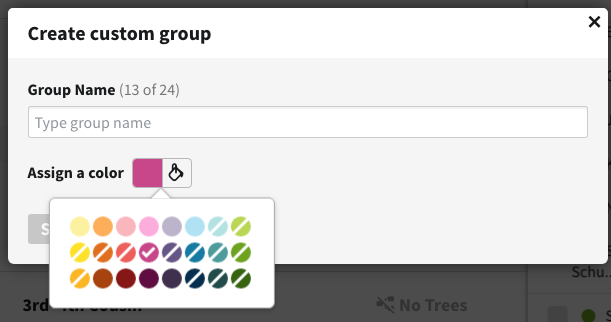
As you can see in the images, in the past I’ve tried to visually tag my matches according as maternal or paternal lines using the colored, heart emoticons. We now have the ability to tag our matches as part of Ancestry’s interface. We can create up to 24, color-coded groups which we can then use to filter the match view by group.
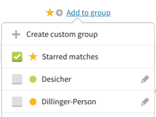
Ancestry included the star in this tool, in effect giving you a 25th tag for your matches. To see the name of an assigned group on the list page—it can be hard to remember what each color represents, click on the colored dot and the “add to group” menu pops-up.
I’ve already made good use of this tool, creating 12 groups. The colors I’ve used are marked by the white slash, indicating they can’t be selected when creating a new group.
The group list also includes the ability to filter by:
- all matches,
- new matches,
- close matches (4th cousin or closer),
- distant matches,
- hidden matches, and
- matches shared with a parent (if tested).
Switch Kits
One addition I particularly like was the ability to switch between the kits you manage directly from the match list.
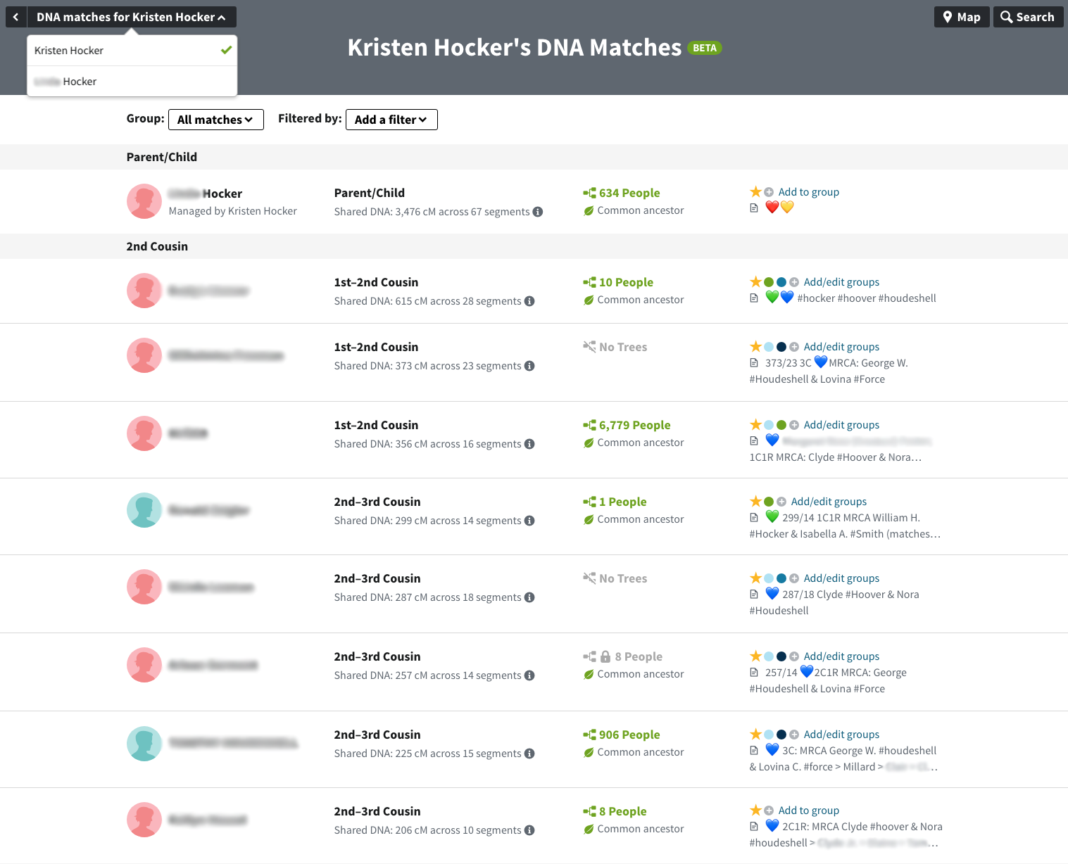
Now you don’t have to return to your DNA overview page to see another kit’s match list.
Match Detail Page
The match detail page has also changed dramatically (see below). We got a preview of these changes when Ancestry added the compare button allowing us to compare ethnicities with a match.
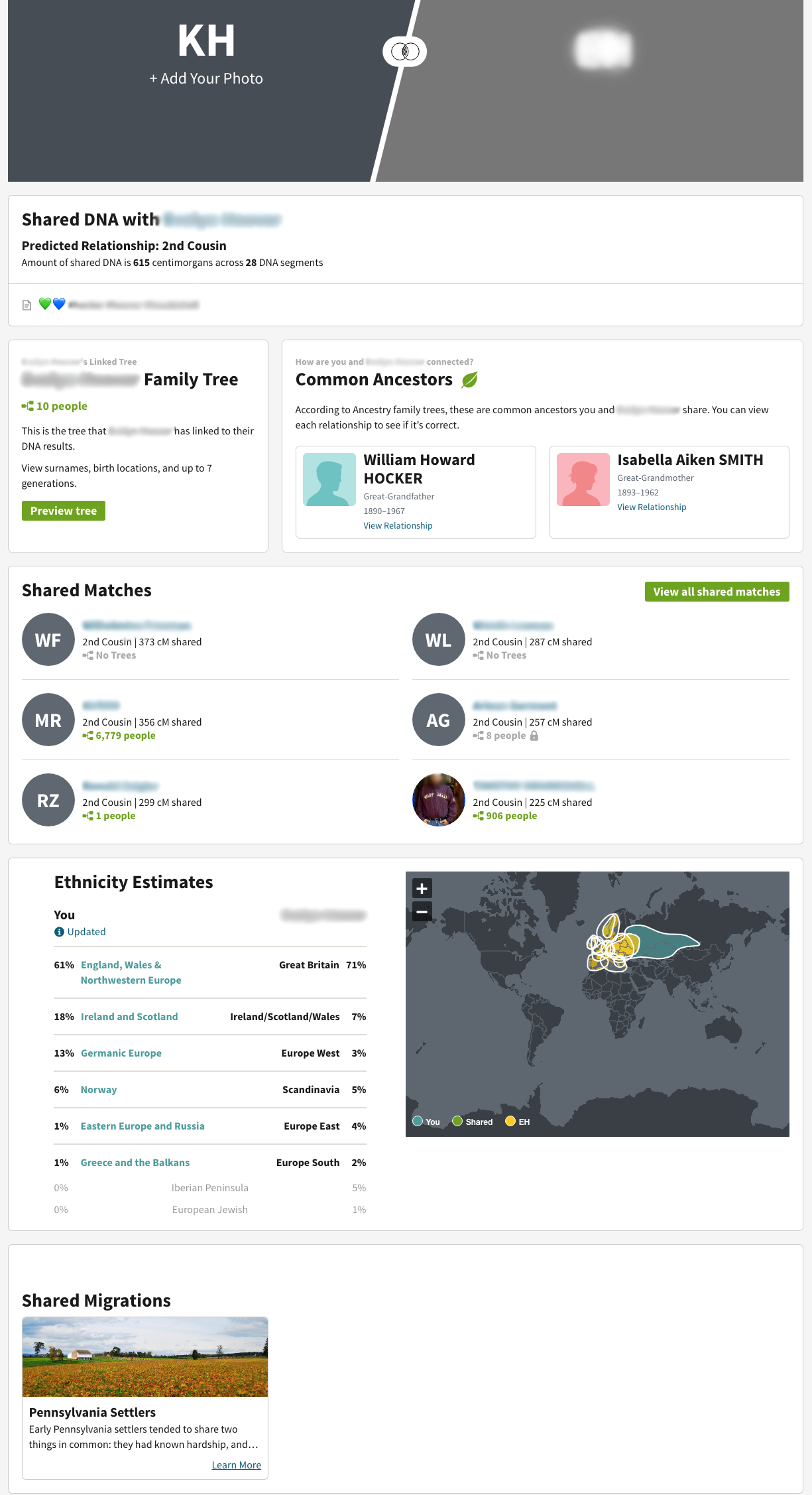
The page is divided into information blocks. Below that header images of you and your match (if available), is a summary block that includes the predicted relationship, amount of shared DNA and any notes.
Next, there is a block with information about your match’s tree. To see the tree you need to click on the “preview tree” button to go to the old match detail page. As a designer, I understand the decision not to show it on this page, but as user I think it’s a step in the wrong direction.
However, perhaps Ancestry assumed the “Common Ancestors” on this page would negate the need for the tree. This is their new ThruLines™ as incorporated into the match detail page. I will wrote more about this feature, but in short it suggests a common ancestor between you and your match. If you click on one of the people, you will see the path to this ancestor for you and your match.
The page shows several of your shared matches. Clicking on the “View all shared matches” button will take you to a list of all your shared matches. On this page, you can add each match to a group.
Below this, there is a map display comparing ethnicity estimates for you and your match, as well, as any shared migrations you may have.
Concerns
I’m thrilled that Ancestry has made these changes. They’ve taken some of the techniques we’ve been using to manage our genetic genealogy research and incorporated them directly into the Ancestry experience. It’s not ground-breaking, but it’s a heck of a lot more convenient.
However, there are a couple of changes I would like to see. A couple of things I’d like to be able do on the match detail page:
- Edit your notes
- See the group to which this match is assigned and/or add the match to a group
- See all your common ancestors—so far, I’ve only see one couple displayed
- Switch to another kit who also matches this person
Currently, this page is a display page. You can get some information on the match and go elsewhere for more details, but you cannot interact with or manage it on this page. The old page was much more useful.
On the match list page—particularly when viewing a shared match list—it would be great to be able to bulk add matches to a list. Currently, you have to do it one-by-one.
The tool is still in beta so I expect there will be some changes. If you have ideas, please provide your feedback to the Ancestry team.
Opt-In/Out
You can opt-in or opt-out of this feature by selecting Ancestry Lab under the Extras menu.
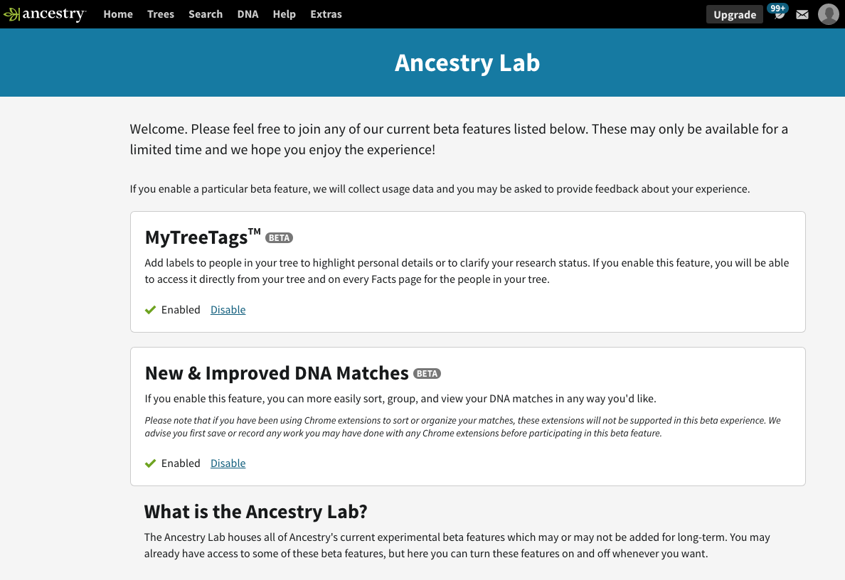
To opt-in click the Enable link in the “New & Improved DNA Matches” box. Opting out is a simple as clicking the Disable link.
Cite This Page:
Kris Hocker, "Ancestry’s New & Improved DNA Matches," A Pennsylvania Dutch Genealogy, the genealogy & family research site of Kris Hocker, modified 28 Feb 2019 (https://www.krishocker.com/ancestrys-new-improved-dna-matches/ : accessed 6 May 2026).
Content copyright © 2019 Kris Hocker. Please do not copy without prior permission, attribution, and link back to this page.